
UI/UX Design
Branding
TOOLS
Figma
Adobe Illustrator
YEAR
2024
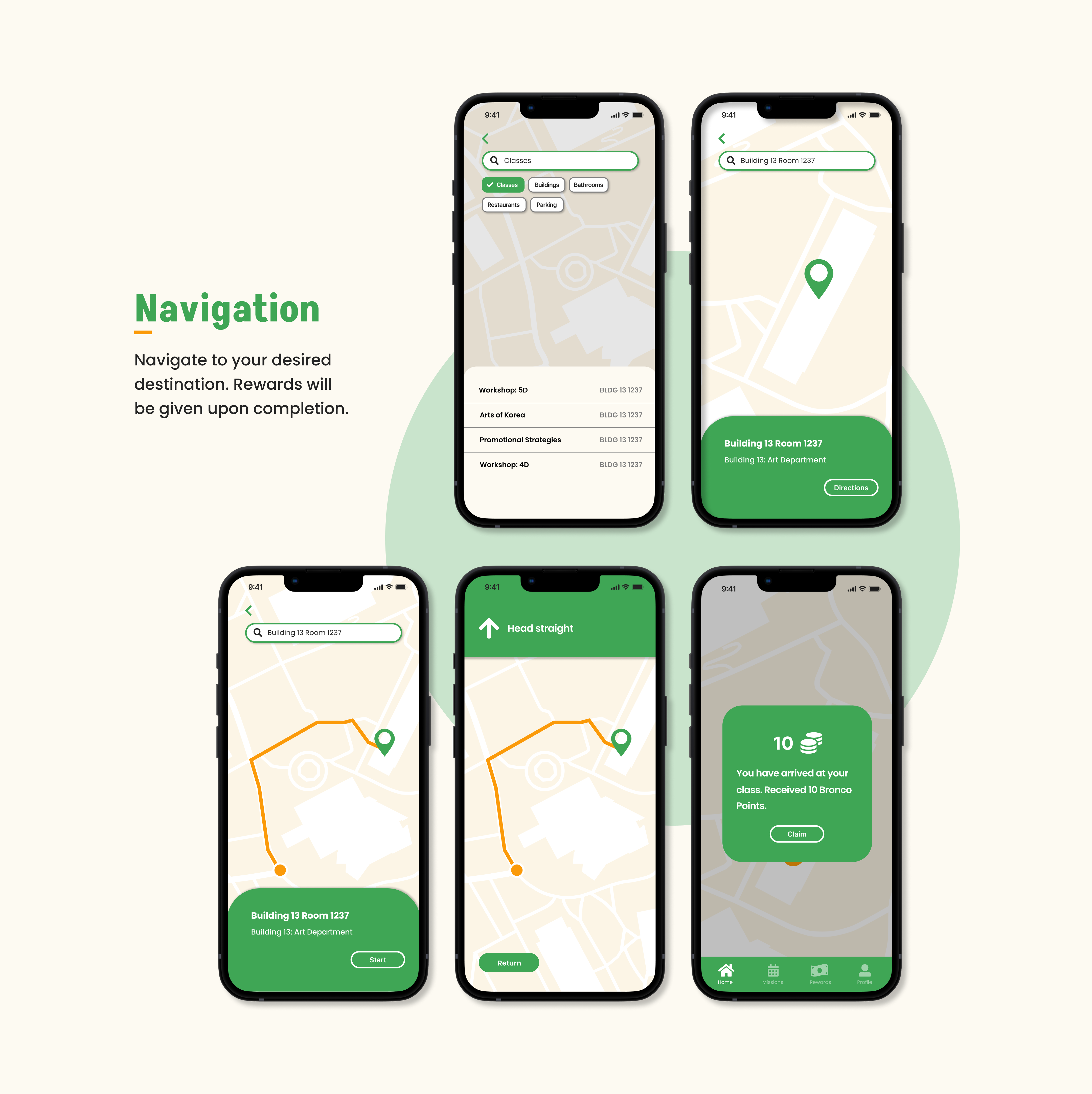
CPP Nav is a navigation x rewards app that helps students get to their desired location on campus while giving them rewards for reaching their destination, combining both utility and entertainment for students.
Designed a logo and color palette that fits with the app's purpose. Created intuitive screens that both meets the needs of the intended audience while also including a rewards system for long-term user retention.
The CPP Nav logo features a navigation icon pointed directly on top of a coin, demonstrating the app’s usage as a navigation app that also gives rewards.
The school colors are implemented into the logo to highlight the app’s focus on specifically the Cal Poly Pomona campus. Gold is used as an accent color that contrasts well with the beige and green, while also reflecting the color of a coin to represent the rewards system.


The color palette uses a beige background with the school colors, green and two shades of gold, that contrast well against the background.
The fonts used have a slightly playful look to match the gaming aspect of the app. Poppins is the main font for the app, used for body text and subtitles, while the font Akshar is used for titles.